Google is continuously updating the YouTube Music service to increase the user experience to the maximum. Now, the YouTube Music share sheet for Android gets redesigned to provide an organized look on the screen. It usually takes up much less space on the screen as compared to the previous version.
Though this isn’t a huge update for YouTube Music users, it’s one of the visual interface changes for the share sheet that you can get. The YouTube Music app version for Android has become quite user-friendly over a period and now it’s time for the share sheet. This new share sheet interface offers a carousel instead of the grid interface that seems clean and minimal.
The older share sheet interface of the YouTube Music app for Android had the whole display covered. However, the overall sharing feature and accessibility remain the same. So, if you’re interested in a minimal design interface instead of a bigger grid-based layout, this new update is only for you.

Now, the newly introduced share sheet interface with the carousel shows five app-sharing options in a single line at a time. Though the redesigned interface is quite compact, users will have to swipe the app sharing list to access more apps to choose from.
You May Also Like: [How to Get] YouTube Music reportedly set to get Hum to Search Feature
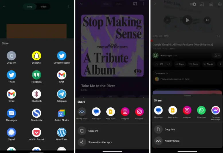
So, whenever you tap on the Share button, the YouTube Music for Android app opens up a menu that mostly consumes up to 2/3 of the screen from the vertical side. You’ll be able to copy the music link as well as other app-sharing options on your Android device. That means tapping on the share option will no longer open a big grid-layout which looks bad.
Via: 9to5Google
